BRAND PRESENTATION
BrandShift
From vision to visible impact.
Brand identity & guidelines
Communication & marketing
THE IDEA
A visual system with forward movement.
A brand identity system for a communication and digital marketing agency, extending from its core visual codes into a documented set of applications.
VISUAL DIRECTION
Red, black and white establish a direct visual voice. Space Grotesk and Inter bring consistency to typography across the identity and its supporting guidelines.
- Designer
- Youssef Aamir / NDIDART
- Contribution
- Creative lead — visual identity and brand guidelines.
EXPLORE THE SYSTEM / 02 CHAPTERS
Inside the project.
Start anywhere.
Every detail is connected.
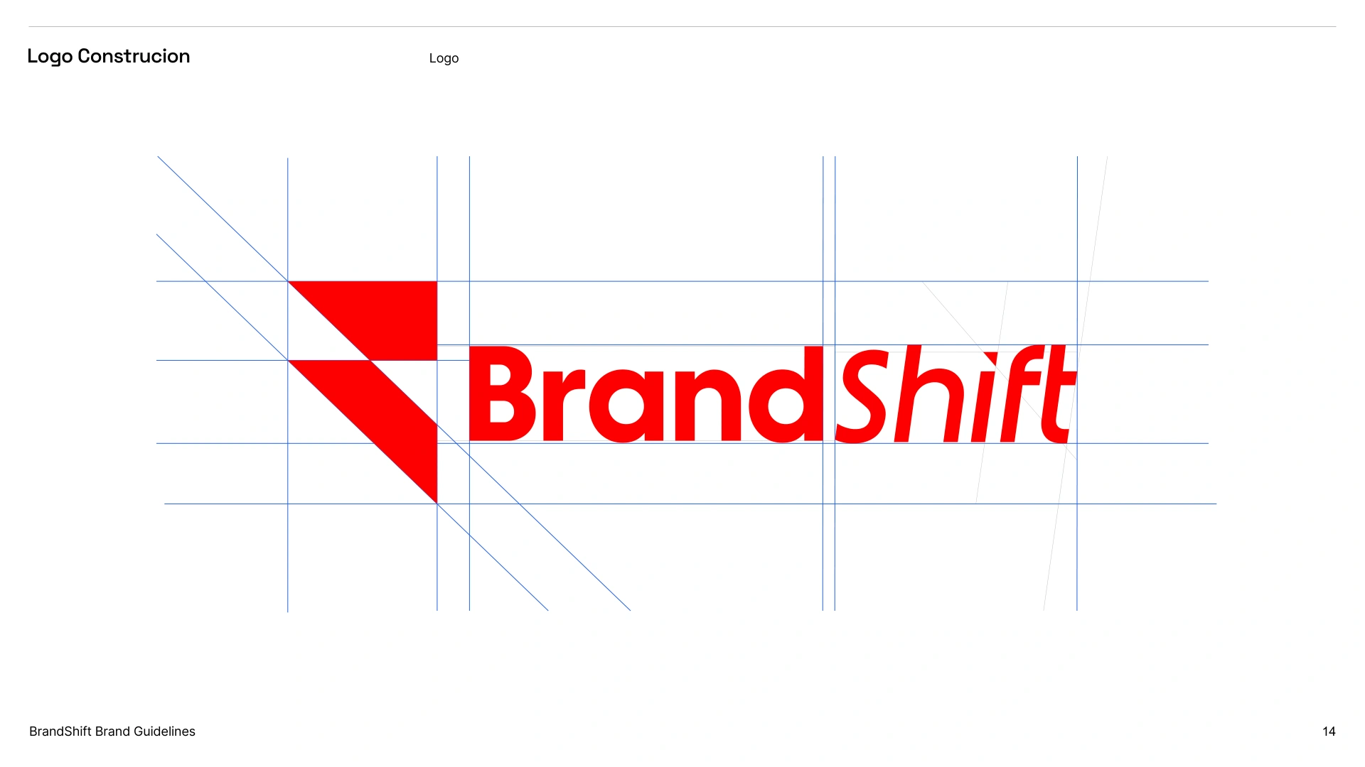
LOGO CONSTRUCTION
An angled mark. A moving wordmark.
The geometric symbol and slanted Shift lettering give the logo its sense of direction. The construction sheet documents the relationships between the elements.
BRAND GUIDELINES
Red, black and white. Consistently.
The identity is documented through brand guidelines, with Space Grotesk and Inter supporting its typography. The red cover establishes the same direct voice as the mark.

LET’S WORK TOGETHER
Your next idea.Let’s give it form.