
BRAND PRESENTATION
MultiShift
From vision to reality.
Brand identity & guidelines
Interior & exterior design

THE IDEA
One geometry. Many expressions.
A visual identity for an interior and exterior design company connecting 3D design with real-world execution. The brand guidelines document the logo, colour palette, typography and image direction, then carry the system into print, signage, workwear and digital applications.
VISUAL DIRECTION
Diagonal cuts give the M symbol its structure and sense of movement. Lime yellow contrasts with charcoal black and white, while burgundy extends the palette. A repeating geometric pattern connects small printed pieces to larger brand surfaces.
- Designer
- Youssef Aamir / NDIDART
- Contribution
- Brand identity, brand guidelines, graphic pattern and application design.
EXPLORE THE SYSTEM / 13 CHAPTERS
Inside the project.
Start anywhere.
Every detail is connected.

BRAND GUIDELINES
From an idea to a complete identity.
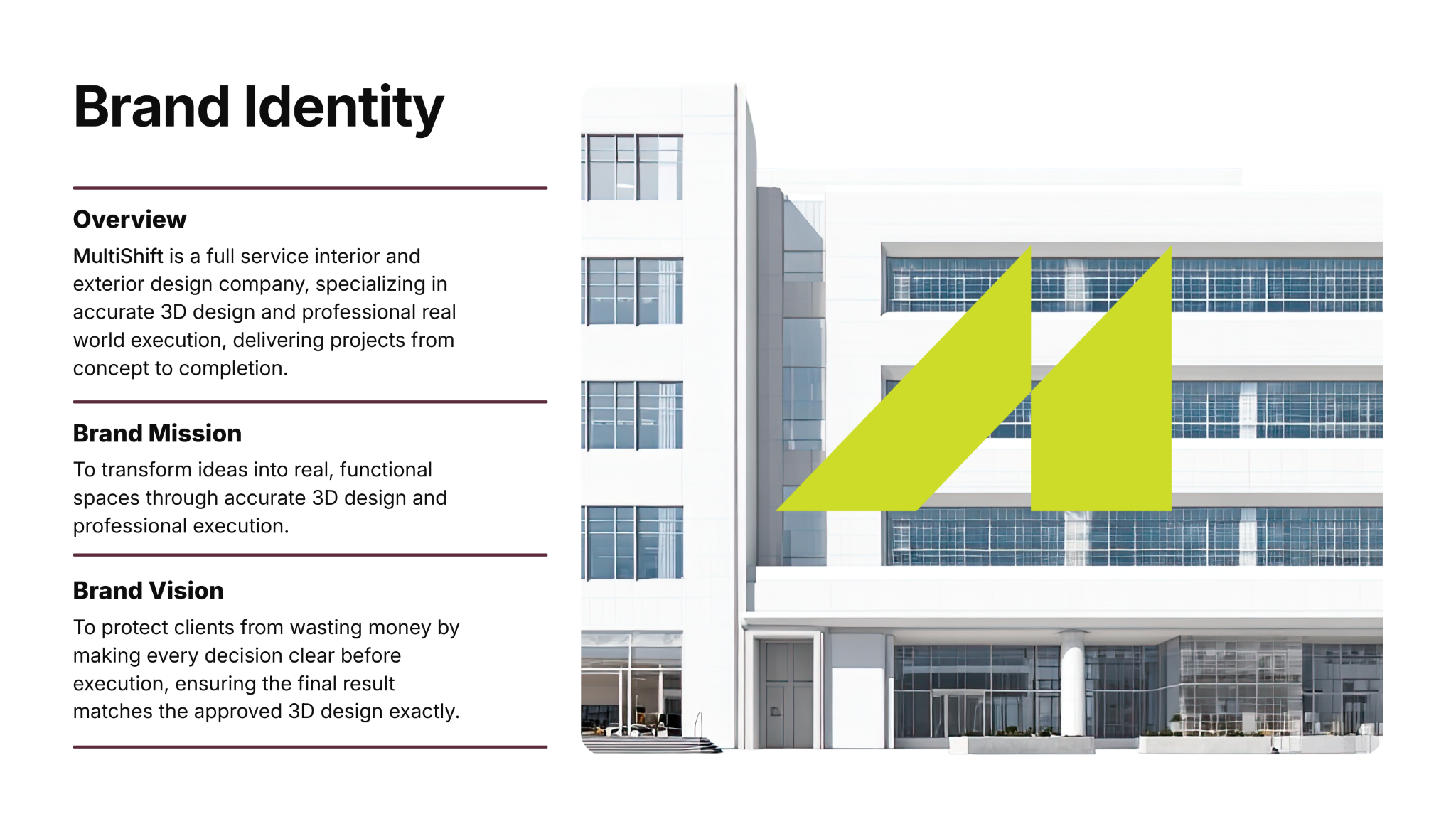
MultiShift designs interior and exterior spaces, connecting 3D design with real-world execution. The guidelines introduce the brand, its mission and its vision before defining the visual system.
WORDMARK + ICON
A signature built from angles.
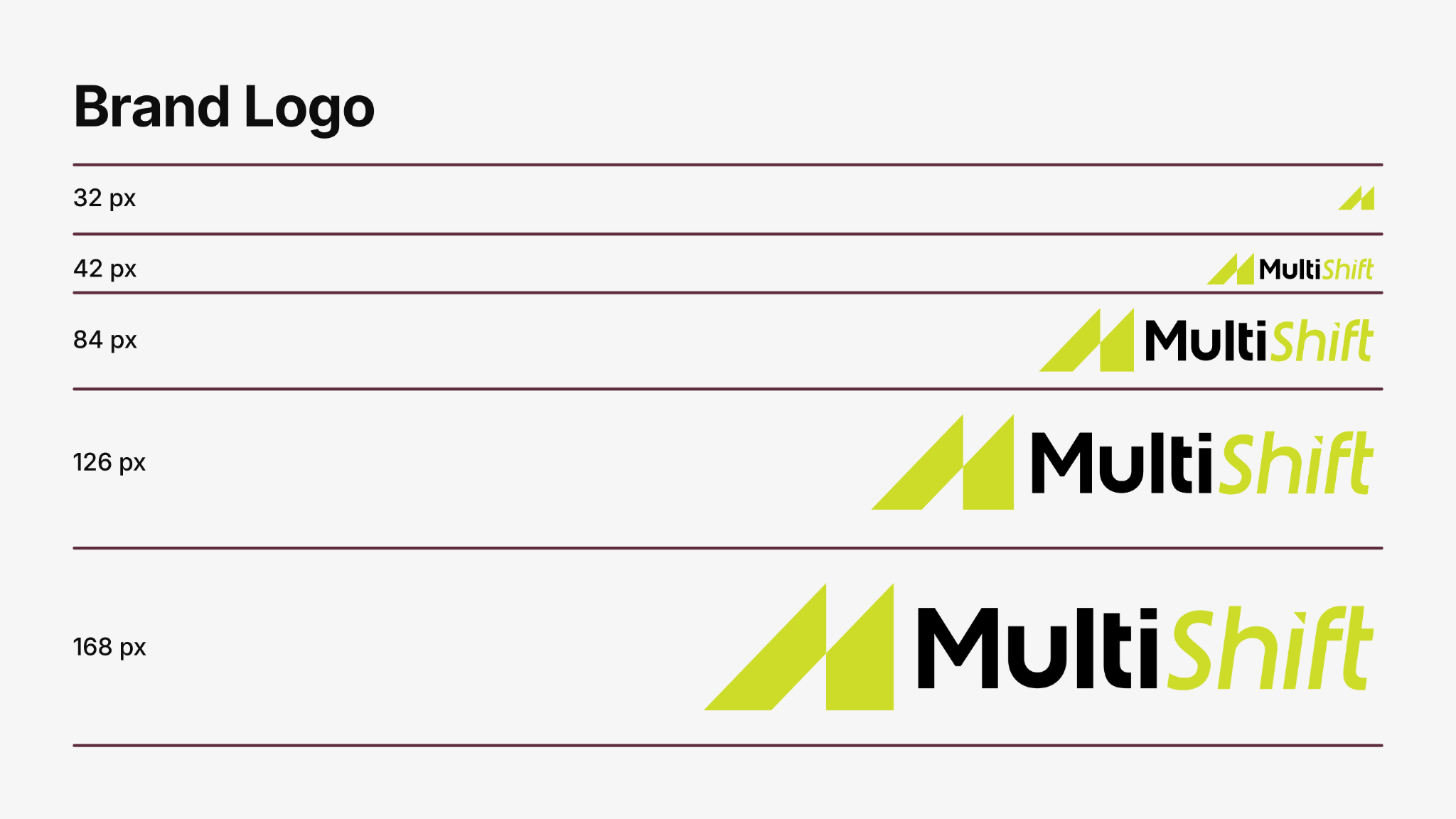
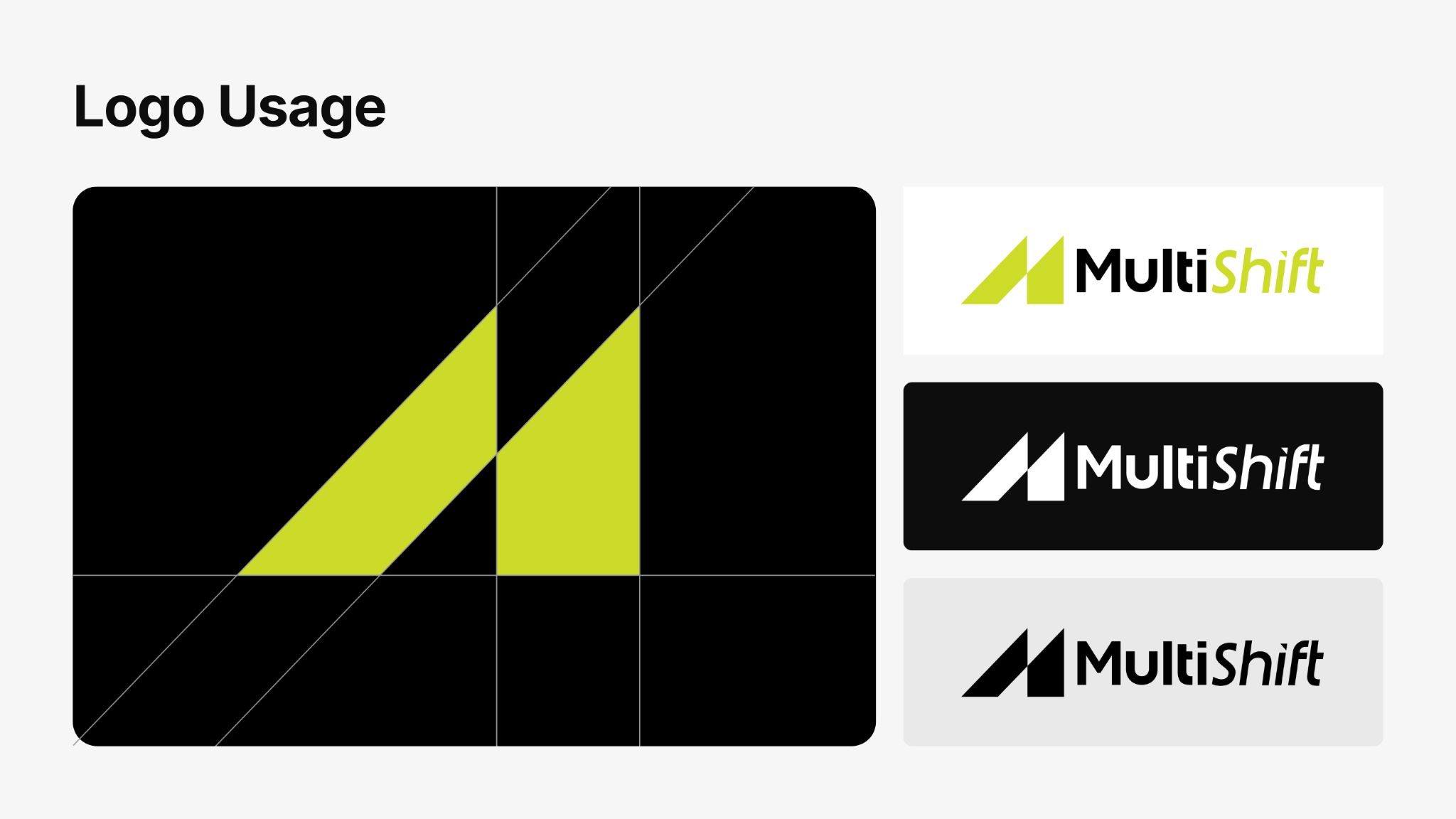
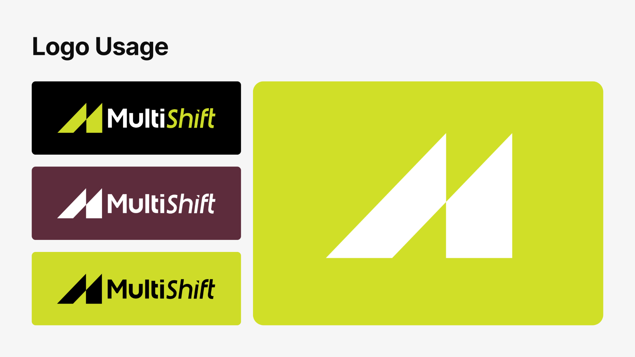
Two angular forms construct the M symbol. The horizontal signature pairs it with the MultiShift name in white and yellow-green. The compact symbol preserves the same geometry when the full name is not needed.

LOGO GUIDELINES
A consistent signature at every scale.
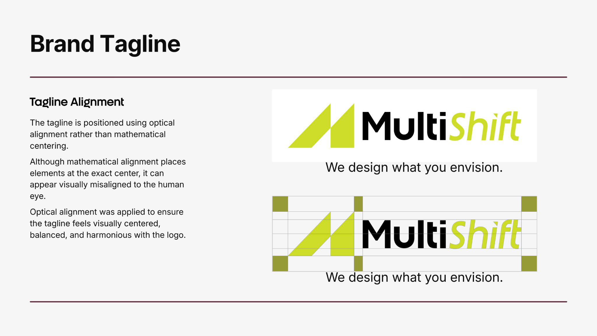
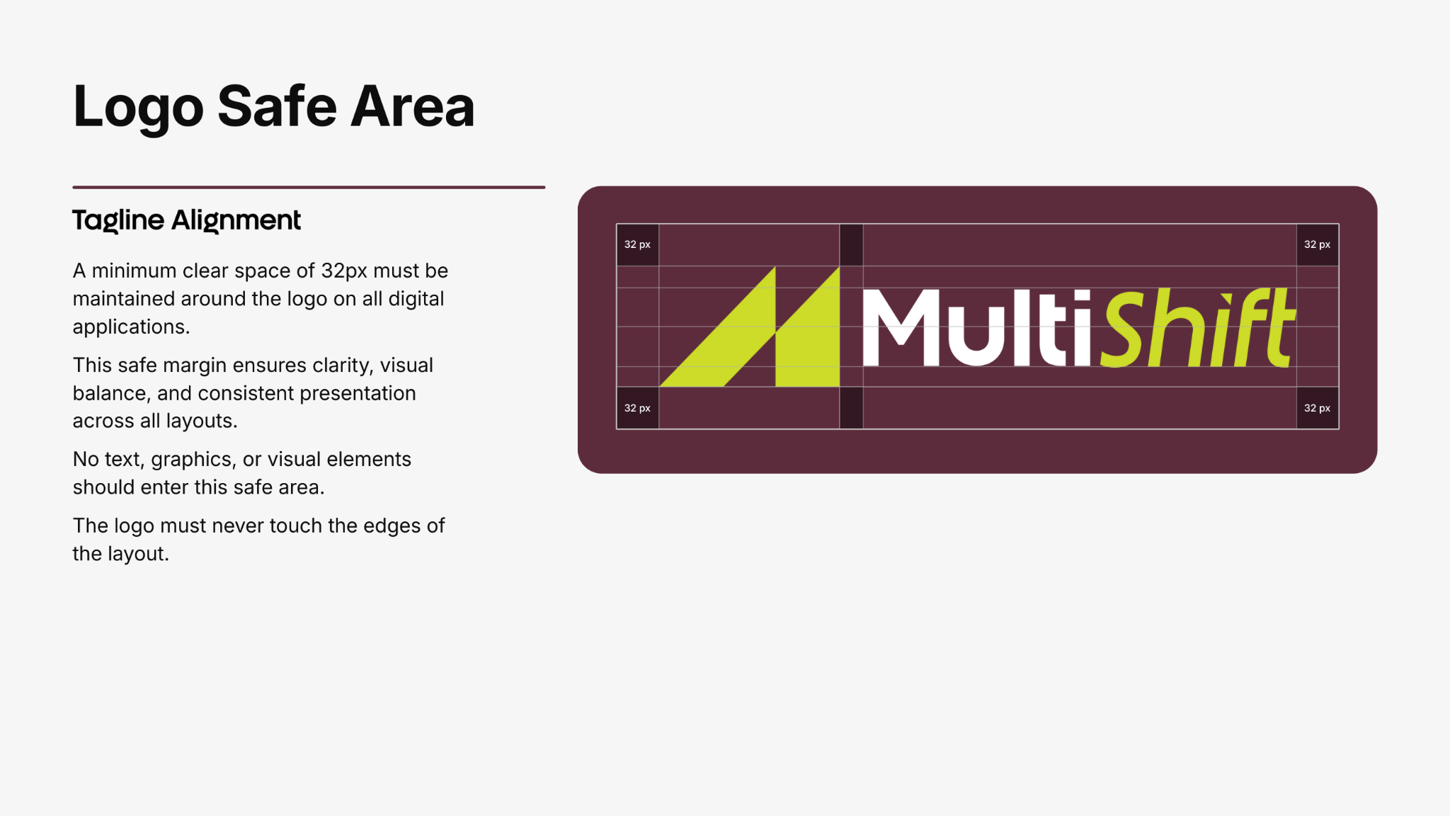
The guide documents logo sizing, the tagline, optical alignment, symbol construction and background variations. Clear-space rules give the signature room to remain legible across applications.
COLOUR PALETTE
Contrast with a distinctive accent.
Lime Yellow (#CCDB29) leads the palette, supported by Charcoal Black (#231F20), Burgundy (#5D2C3C), Light Grey (#E9E9E9) and Pure White (#FFFFFF). Select a colour to copy its HEX code.
Select a colour to copy its HEX code.
TYPOGRAPHY
A clear hierarchy, from headline to detail.
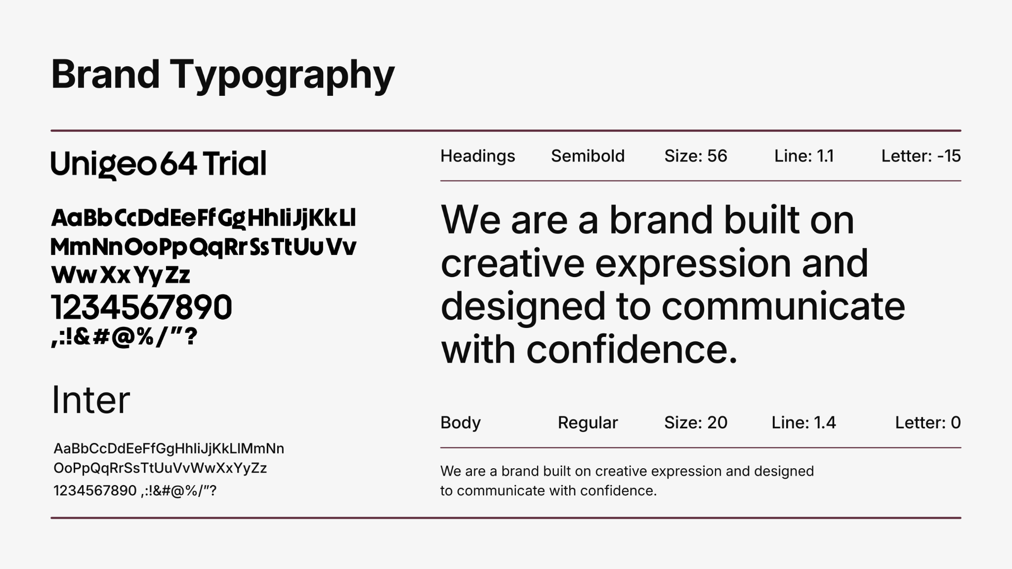
Unigeo64 Trial Semibold gives headings their geometric character. Inter Regular supports body copy. The specimen sets out their roles alongside size, line-height and spacing guidance.
PHOTOGRAPHY + SOCIAL
A visual direction grounded in spaces.
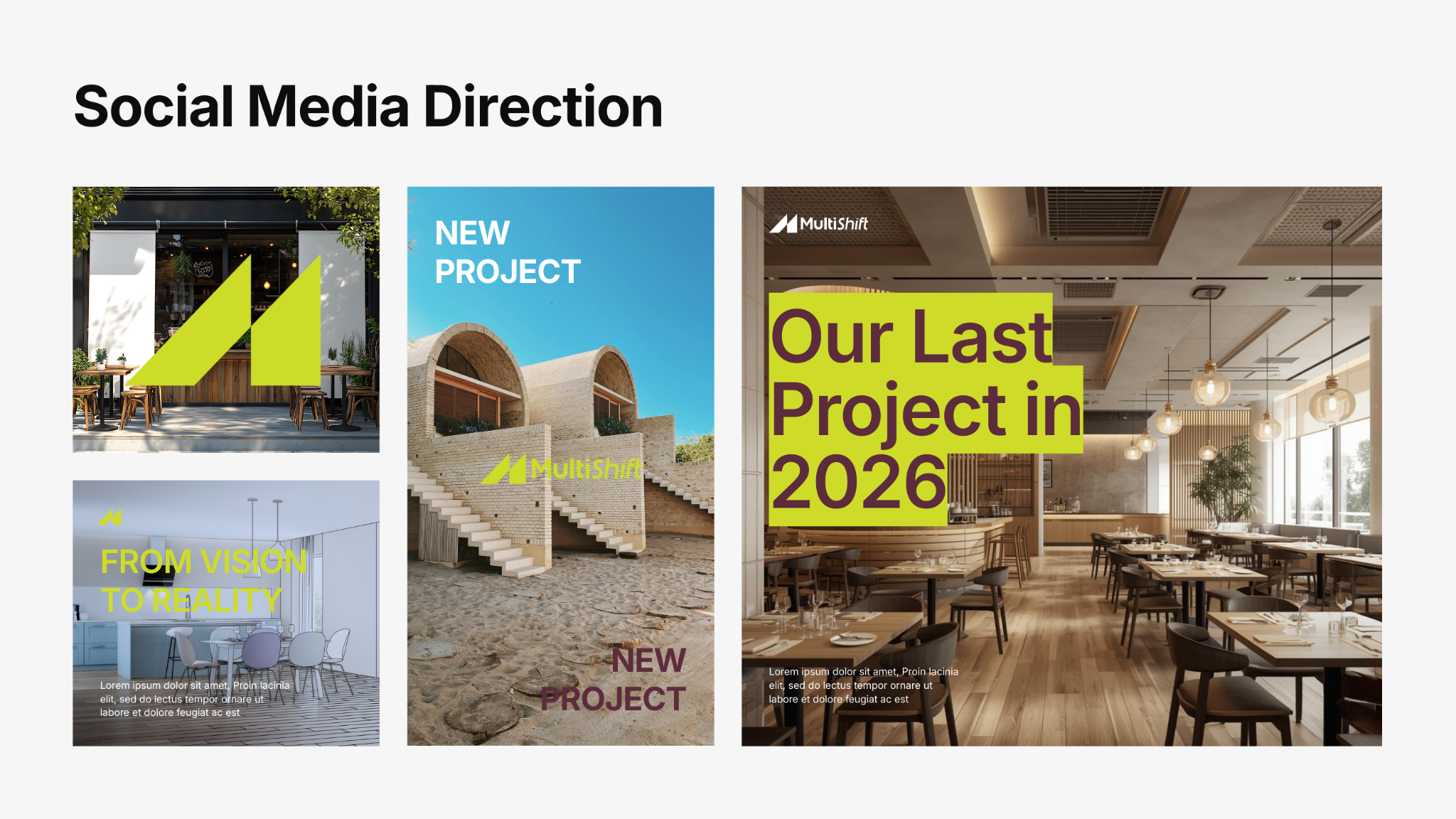
The photography moodboard brings together architecture, interiors, materials and people at work as visual references. Social media examples translate that direction into branded layouts for project stories and announcements.

USAGE PRINCIPLES
Keep every application coherent.
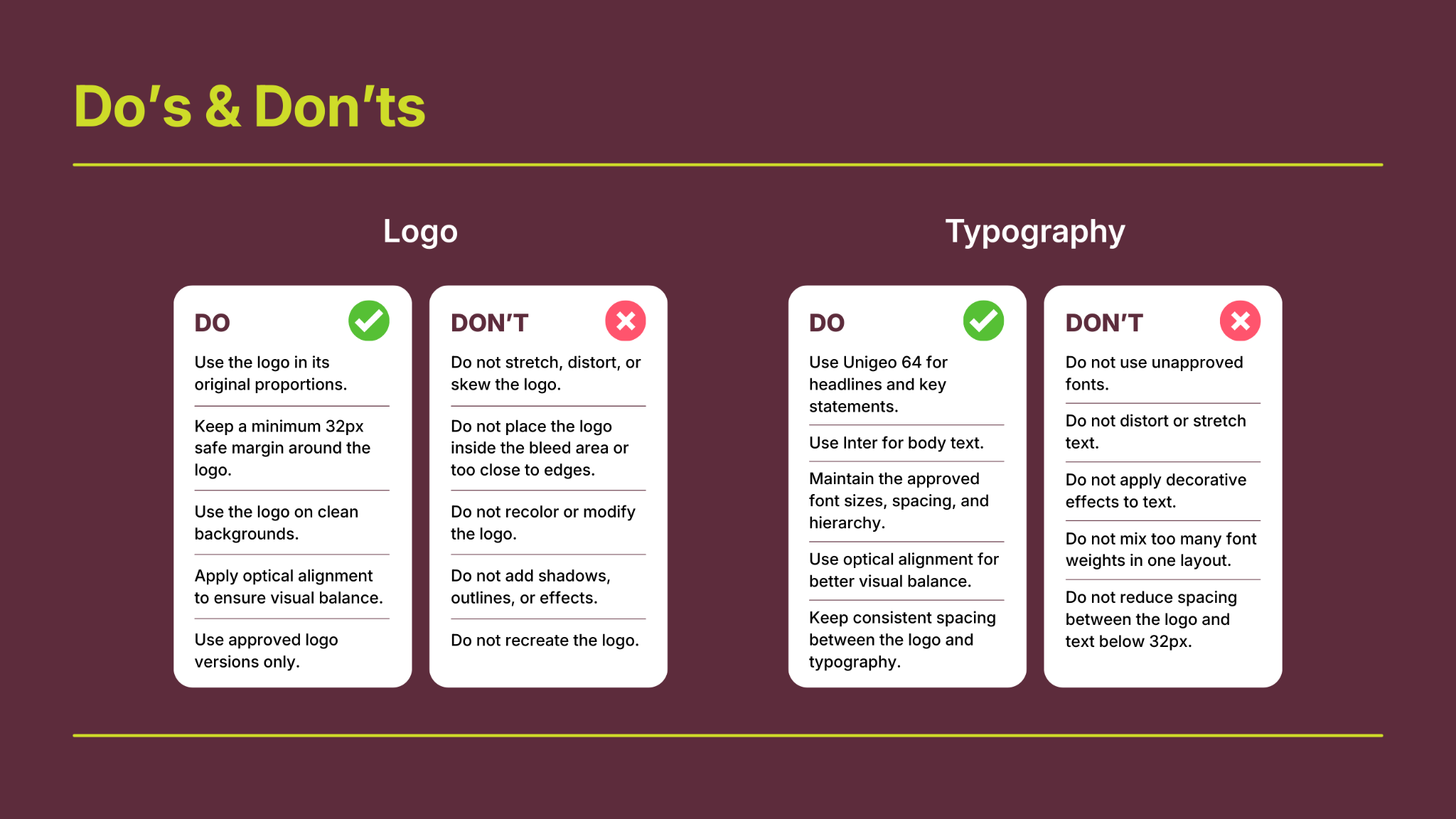
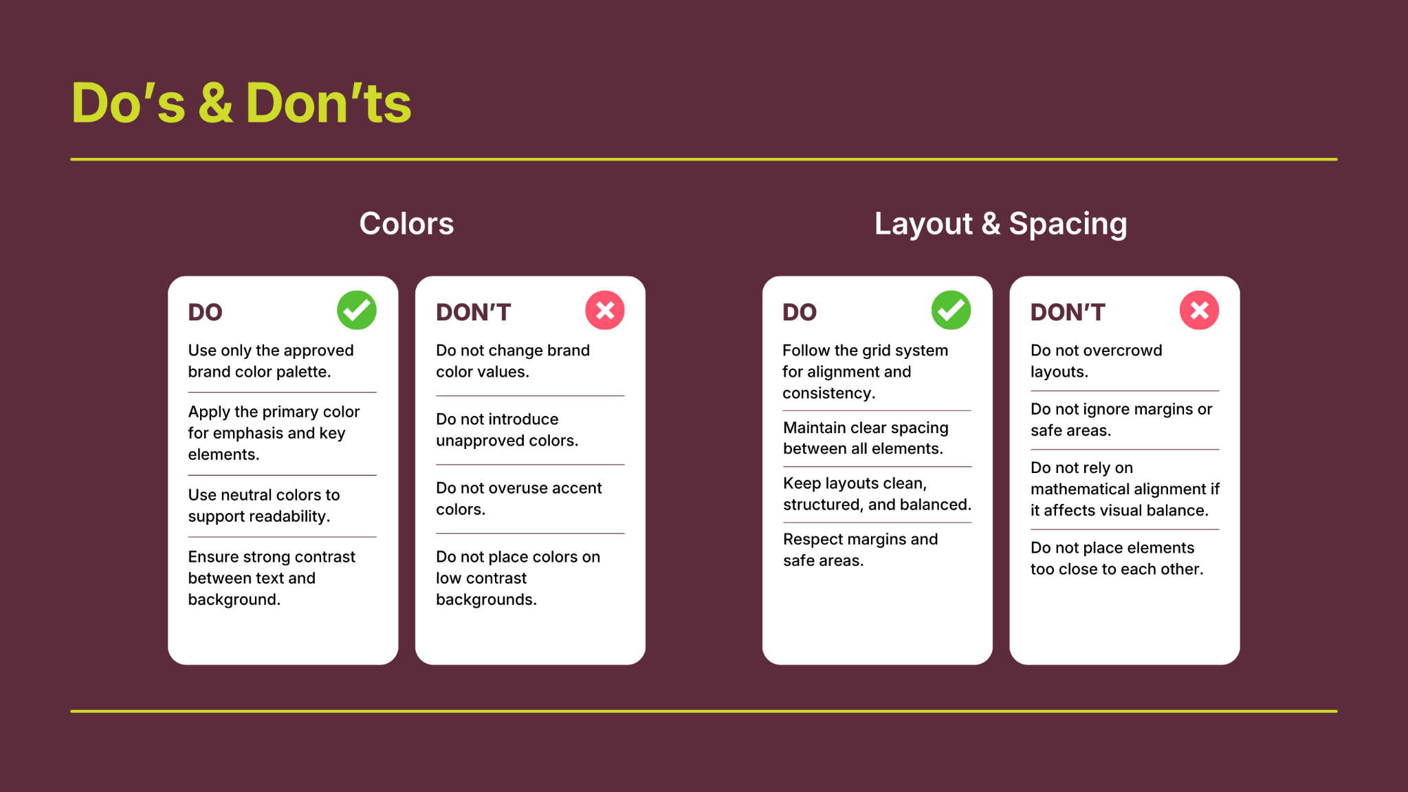
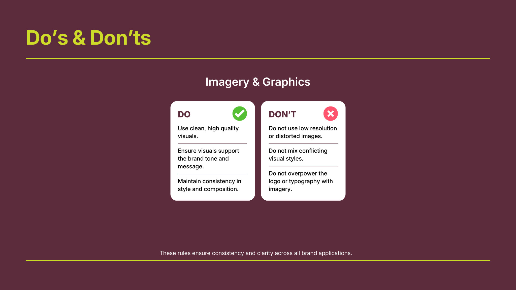
The do’s and don’ts bring the system into everyday use: preserve the logo, maintain typographic hierarchy, use the palette consistently and give content enough space. Image and graphic examples complete the guidance.
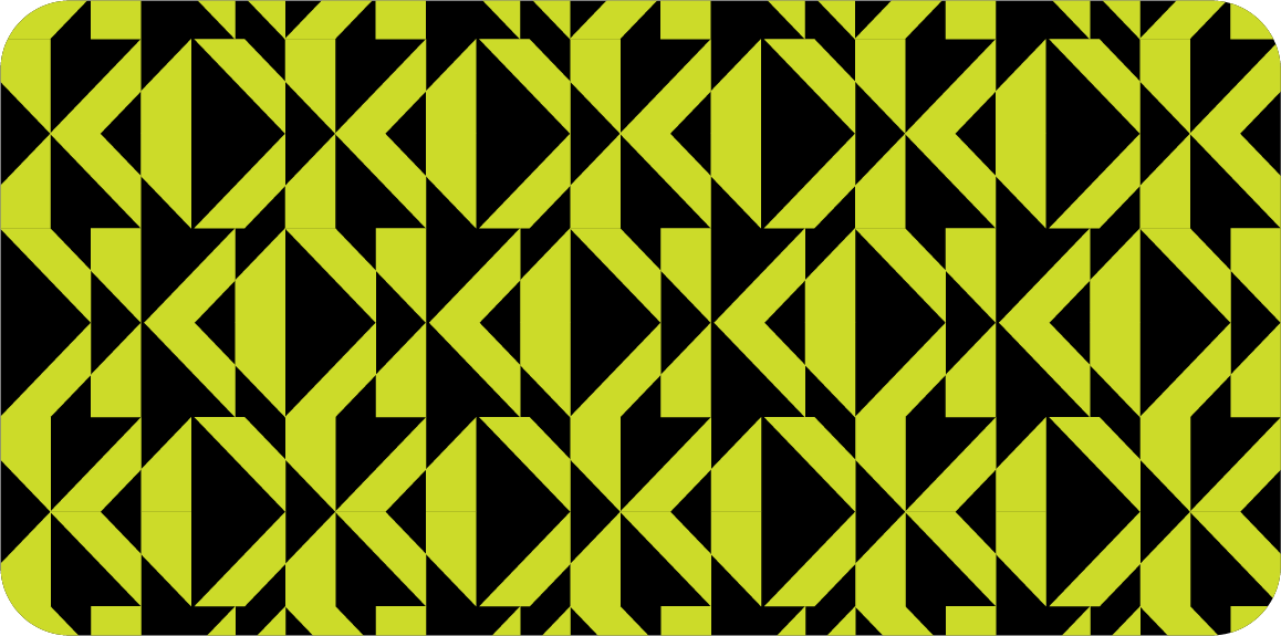
GRAPHIC PATTERN
The mark becomes a visual rhythm.
Repeated diagonals extend the identity into a dense geometric pattern. Yellow-green and black alternate across the composition, giving borders, backgrounds and printed surfaces a recognisable connection to the symbol.
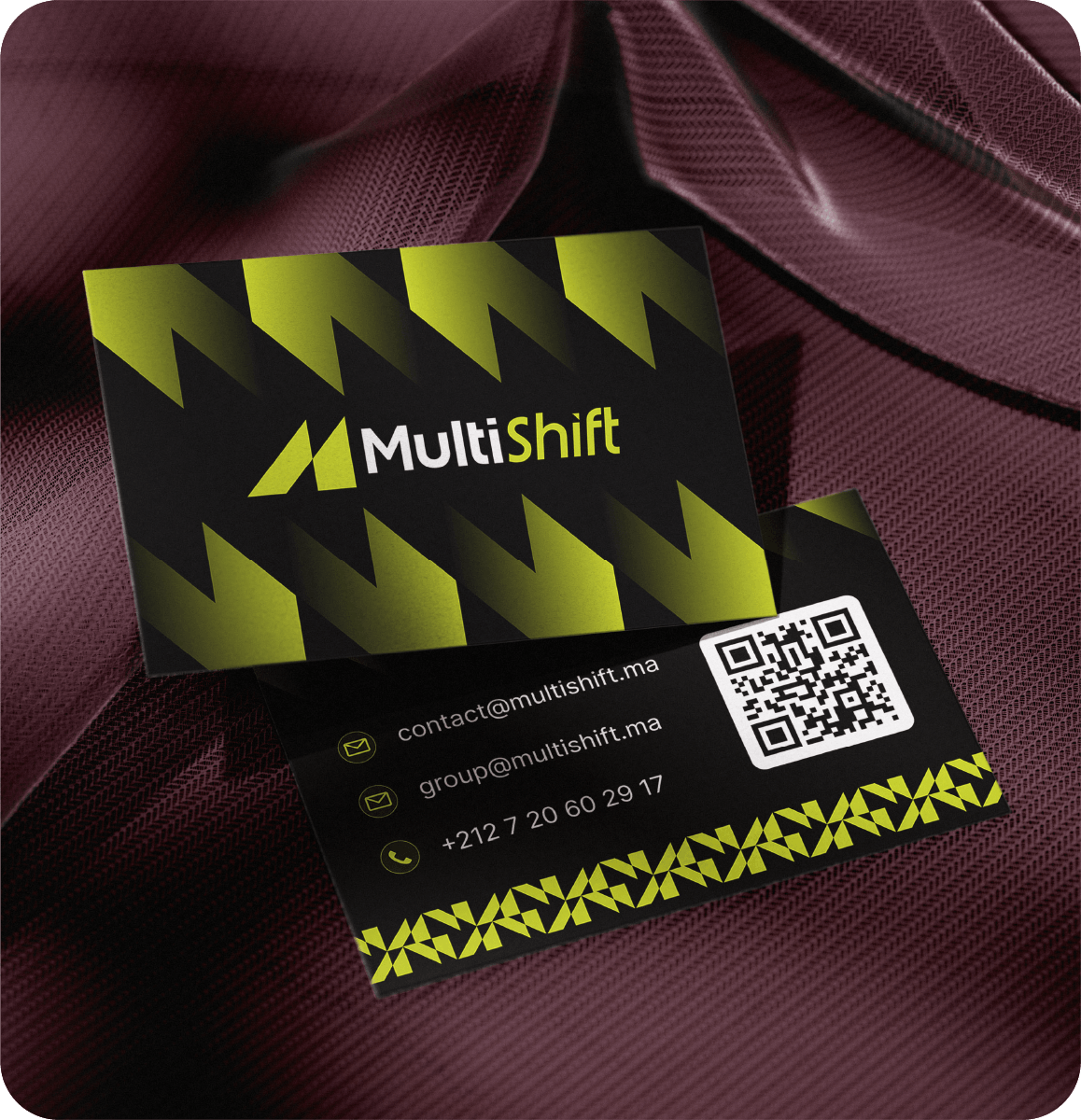
BUSINESS CARD
The system in a compact format.
The front leads with the logo and enlarged angular shapes. The reverse organises contact details and a QR code above a patterned border. This supplied presentation mockup brings both sides together.
BILLBOARD + SIGNAGE
A recognisable presence at scale.
The billboard pairs the message From Vision to Reality with a bold border and dark background. The building-signage study translates the logo into dimensional lettering. Both are presentation mockups showing how the identity can work in a physical setting.


WORKWEAR APPLICATIONS
A signature for the working environment.
A high-visibility vest and a safety helmet carry the logo into workwear studies. Compact placements on the chest, back and helmet demonstrate the mark at different sizes. These are visual mockups of the identity applications.


DIGITAL APPLICATIONS
The same identity, on screen.
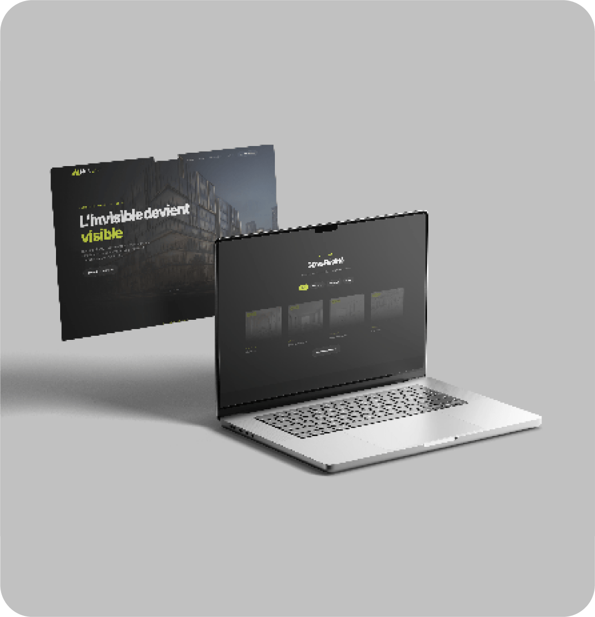
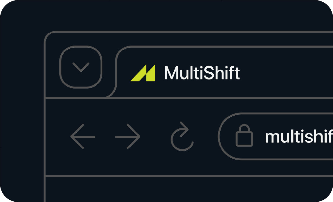
A website presentation explores dark surfaces and yellow-green accents. A browser-tab study shows the compact symbol alongside the brand name, connecting the full digital layout to its smallest identifying detail.
GUIDE CLOSING
One reference for the whole brand.
The closing page completes the guidelines, bringing the identity and its applications together in a shared reference.
LET’S WORK TOGETHER
Your next idea.Let’s give it form.