BRAND PRESENTATION
OKINSO
Beauty brands. Closer to you.
Brand identity & social design
Multibrand beauty retail
THE IDEA
Many beauty brands. One recognisable destination.
A visual identity for a multibrand beauty store bringing cosmetics, skincare, makeup, haircare and fragrances together under one name. The project covers the logo system, colour palette, Instagram highlights and product-focused social media design.
VISUAL DIRECTION
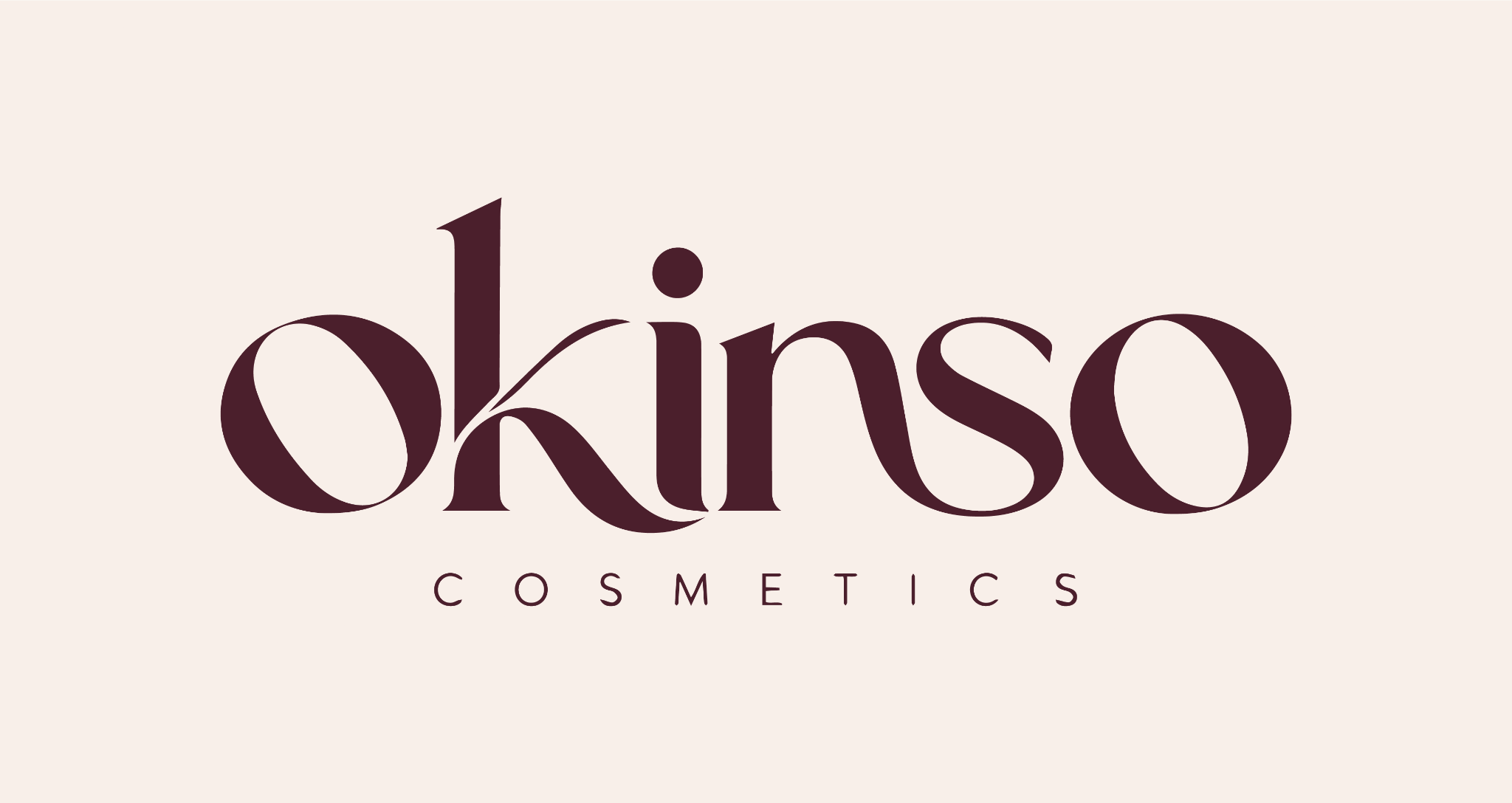
An editorial wordmark and an O-derived icon give Okinso a distinctive signature. Deep plum and warm neutrals establish the store identity, while product campaigns extend the system through expressive imagery and clear messages.
- Designer
- Youssef Aamir / NDIDART
- Contribution
- Wordmark, icon mark, colour palette, Instagram highlights and social media design.
EXPLORE THE SYSTEM / 04 CHAPTERS
Inside the project.
Start anywhere.
Every detail is connected.

WORDMARK + ICON
Distinctive by name. Recognisable by symbol.
The editorial wordmark pairs contrasting strokes and soft curves with a widely spaced Cosmetics descriptor. The icon takes its shape from the O, using an organic curve in the negative space to create a compact signature.

COLOUR PALETTE
Deep plum, balanced by warm neutrals.
Deep Plum anchors the identity, with Cream as its main light background. Dusty Rose and Soft Blush bring softer accents; Warm Taupe completes the supporting palette.
Select a colour to copy its HEX code.
INSTAGRAM HIGHLIGHTS
One family of recognisable icons.
Cream symbols and a thin circular outline create a consistent set of six highlight covers. The sparkle, skincare, makeup, hair, offer and badge motifs share the same deep-plum setting.






SOCIAL MEDIA CAMPAIGN
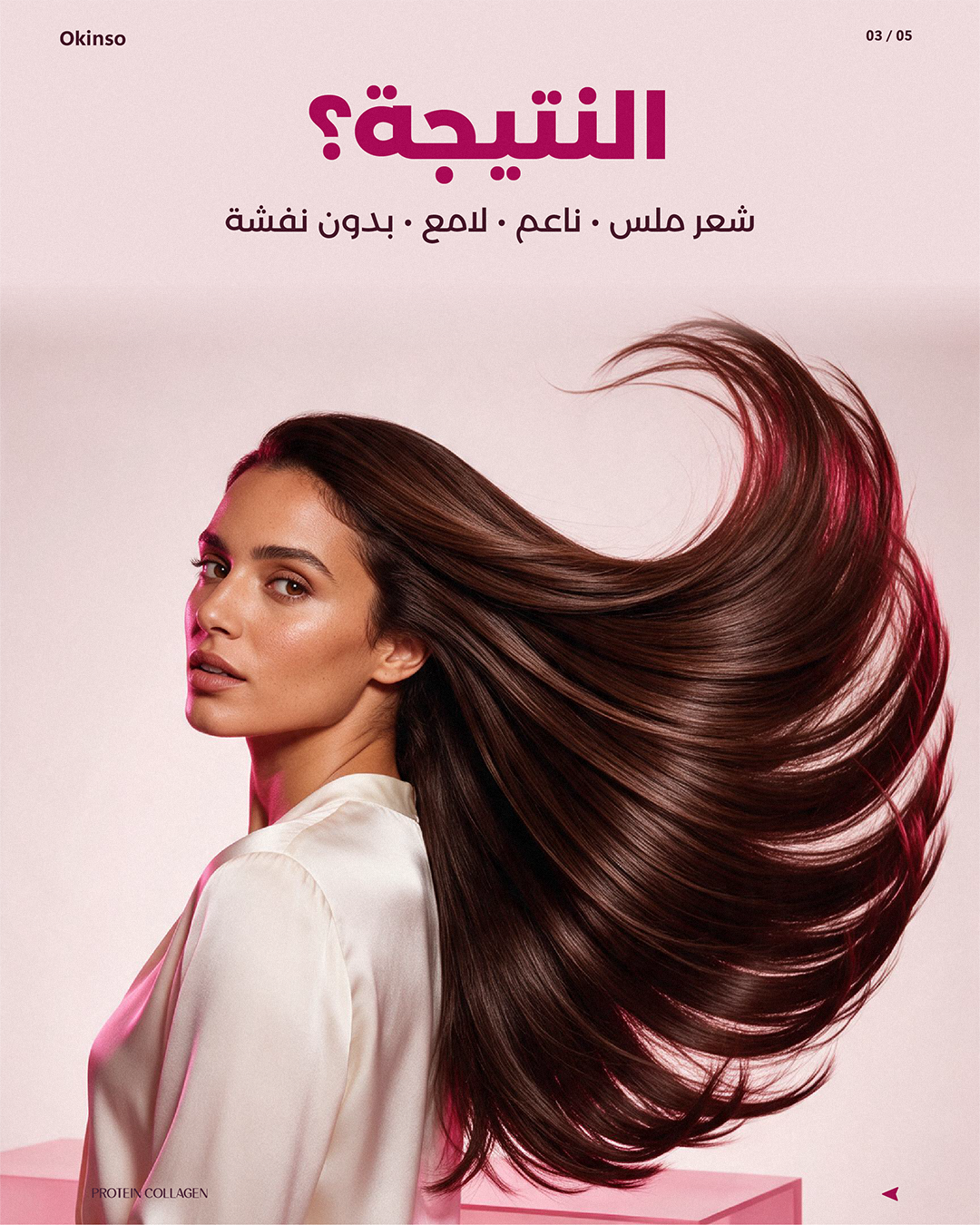
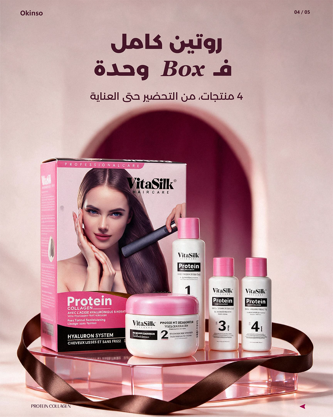
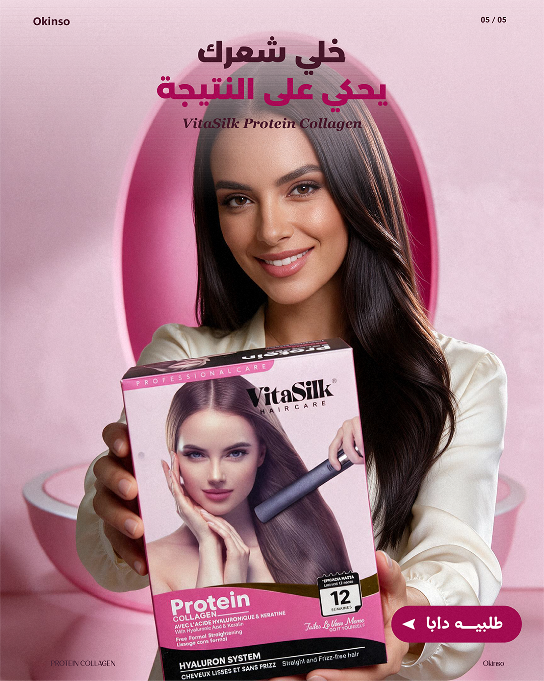
A five-part story for VitaSilk.
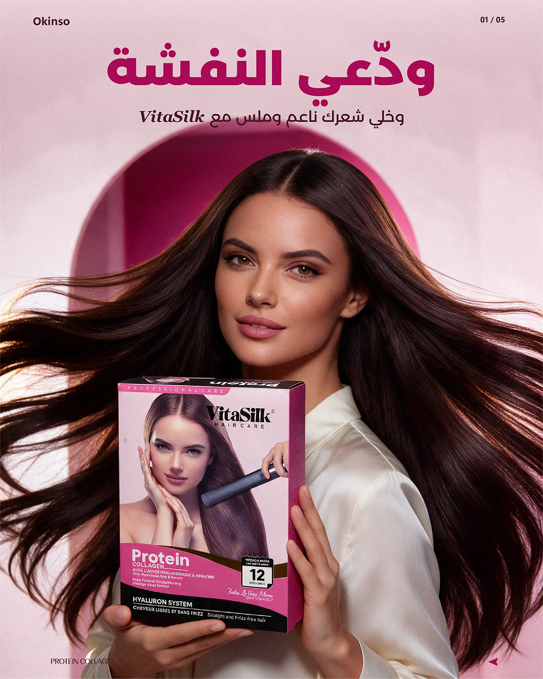
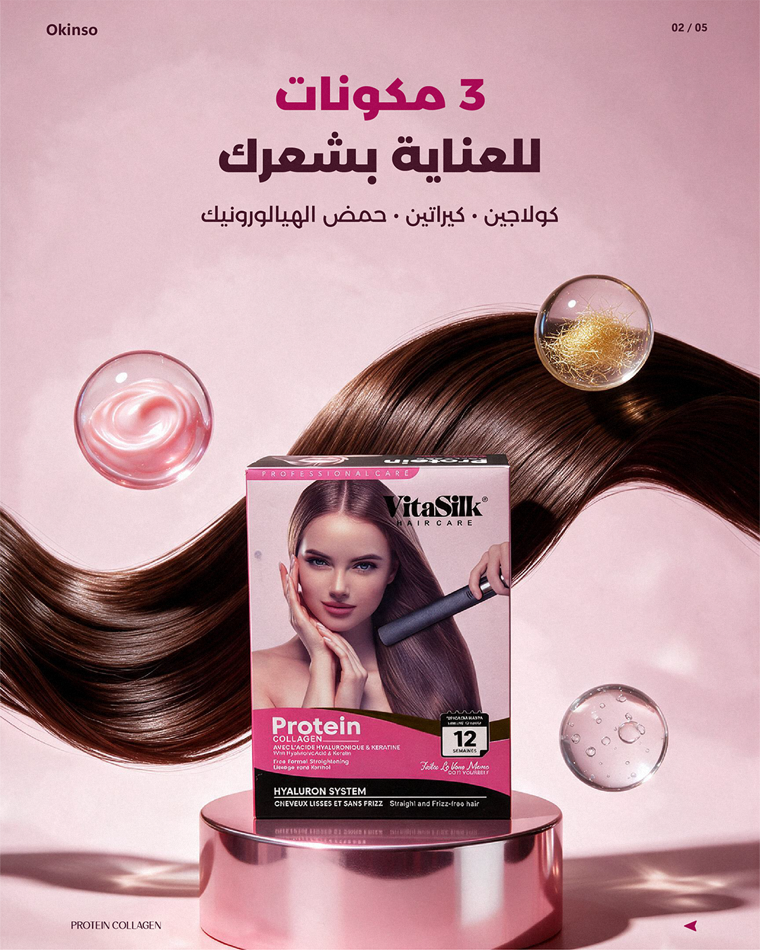
A haircare campaign featuring VitaSilk for Okinso. The five panels move from an opening hook to an ingredient focus, a result-led message, the complete product kit and a closing call to action. Pink tones, flowing hair, product compositions and Darija headlines connect the sequence.
LET’S WORK TOGETHER
Your next idea.Let’s give it form.